How is interactive media presented

Interactive media is presented to a user depending on the media will have different types of users.

The Power of Social Media Marketing in 2018

Social Media:

Social media is an interactive web browser or app that allows for global communication to any person or country and creates allows you to create a social status on how you presented yourself.

Social media has every type of user from high government bodies to average middle-class civilians. The people will artwork, work tips and interests, games and personal life. Social media allows users to interact with people of similar/opposite job interests and helps either gain a good/bad idea of who is the person or company is.

social media helps promote companies goods and popularity across the country/world. Companies pay a lot for advertisement, to get their brand out there to the world to show off what they can give to the user.

WhatsApp Most Downloaded App Globally, TikTok Leads App ...

Apps:

Apps are used on mobile devices, tablets, and TV. It’s a piece of software that can be run with or without the internet. Apps can be a browser for internet banking, social media, games, gambling, self-learning and video uploading or video watching.

social media will even present an advertisement for companies who want to get the user to download so they can make a profit.
Faculty Research Papers and Publications | Concordia ...

Publication:

The publication is the publishment of content which can be seen by any user who wishes to look at. While specific use of the term may vary among countries, it is usually applied to text, images, or other audio-visual content, including paper. The word publication means the act of publishing, and also refers to any printed copies.

The publication is like journalism where written articles are publicised and information on a certain content is revealed. The use of publications is to gain viewers from that sub-category and it can promote demonise a brand depending on how that publisher feels.

Publication helps to promote, commercials, entertainment, and social platforms.

Harry Beck

Henry Charles Beck

London Underground | London Historians' Blog

Harry Beck created the London underground tube map in 1931 Beck draw up the diagram in his spare time while working as an engineering draftsman at the London Underground Signals Office.


Mind your language | Mosaicproject's Blog

London Underground was sceptical of Becks proposal to recreate the London tube map was accurate when to geographical location, but it that made it even harder to understand. He also found out amongst the public that they don’t need to understand what’s above them.

Tube Map Pioneer Harry Beck Receives Blue Plaque | Londonist

Beck first submitted his idea to Frank Pick of London Underground in 1931 but it was considered too radical because it did not show distances relative from any one station to the others. instead, the way Becks presented a three directions horizontal map structure, vertical, or 45 degrees He made every station colour corresponded. He spaced the stations equally so that they are clear to understand when the traveller is presented with this map.

Becks (29) Presented to the London Underground, it was a radical proposal and was also uncommissioned and a self project. He showed it off to the public around 1933 where it immediately became popular. He created a full systematic structure using colours. He believed that Underground passengers were not concerned with geographical accuracy and were more interested in how to get from point A to point B.

File:90 degree rotations expressed in radian measure.svg ...

When he was drawing an electrical circuit diagram, Beck came up with a new idea for a map that was based upon the concept of an electrical schematic on which all the stations were more-or-less equally spaced rather than a geographic map.

Frank Pick - Wikipedia

Beck first submitted his idea to Frank Pick of London Underground in 1931 but it was considered too radical because it did not show distances relative from any one station to the others. The design was therefore rejected by the Publicity department at first, but the designer persisted. So, after a successful trial of 500 copies in 1932, distributed via a select few stations, the map was given its first full publication in 1933 (700,000 copies). The positive reaction from customers proved it was a sound design, and a large reprint was required after only one month.


Interactive Media Examples

What Is Interactive Media?

Interactive Media is a method of various forms of communication in which programs output is depended on the user’s input and the user, in turn, affects the output of the programme. Simply put, it refers to the different ways to which people can process and share information, or how they communicate with one another. Interactive media allows people to connect with others – whether it’s organization – making them active- making them active in participating in media consumption.

Interactive Media comes in all forms of communication these various methods could be the latest smartphone, an atm machine, a visual map, ticket machine, Kiosks ( fast food machines) and supermarket self-checkout.

Smartphones

thumbnail_20191105_154516

thumbnail_20191105_154434


thumbnail_Screenshot_20191104-135918_Google Play Store.jpg

Smartphones are excellent sources of interactive media they are used every day in the modern life of a human and are used to interact with company based apps that allow services or socialising.

The Smartphone is a mobile telephone with a display screen and built-in personal information management programs such as an electronic calendar and addresses book and also a built-in AppStore opens the user to many choices of games, search engines, social media and betting apps.

thumbnail_Screenshot_20191105-160334_One UI Home


Duck DuckGO is a search engine


thumbnail_screenshot_20191105-160334_one-ui-home-1.jpgMario Kart is the most common game i play to this day and is owned by a Japanese game company called Nintendo.

Mario kart is free on the iPhone/Samsung app store it is free to anyone one to play. The app has a money interest called micro-transactions which allow players to buy in-game currencies to bid on items which ascetically look good to the human and is a form of social recognition in the video game community.

thumbnail_screenshot_20191104-135907_one-ui-home.jpg

These are free social media apps on the AppStore on iPhone/Samsung Instagram, Snapchat and Discord are apps i used for social interacting and procrastination. Instagram is a social media platform for young photographers, artists, sports folks, etc.

Automated Teller Machine (ATM)

thumbnail_20191104_145959-e1573049639980.jpg

An automated teller machine is an electronic banking machine that allows customers to complete basic transactions from their bank account without the need of aid from a branch representative or teller.

The interactive use of an ATM needs the user to put in info to access the money in the user’s bank account. A 4 digit security code and the bank card itself allows the use of the account.

The user has the opportunity to take money from the machine from their bank balances or receive a receipt what the digits of their balance. They also can make a basic transaction to different user accounts.

An ATM can deny access to withdraw money from the account if the bank turns the account off. Having communication between the user and bank lies the interactive use of ATM’s without the bank’s permission and your consent the use of withdrawing money from the machine is worthless.


Ticket machine

thumbnail_20191104_145710-1

thumbnail_20191104_145725-1.jpg

A train ticket machine is an interactive device which allows cash, card payment for train tickets and topping oysters digital currency of travel through any station.

To collect a ticket the user needs:

Debit/credit card – sometimes they’ll need the same card that was used to make the booking but sometimes you are able to use a different card.

You go on the user interface to type in your chosen destination from the station you are at to the station your destination ends.

you then tell the machine whether you are a child (16+) or an adult, the prices depend on the age difference.

How to collect your tickets –

  1. Tap the button on-screen to collect tickets.
  2. Insert your debit/credit card. If you paid with PayPal you can insert any card.
  3. Type in your collection reference.
  4. Tap the button to print your tickets, check all your tickets before leaving the machine, if you’re collecting multiple tickets there can be a small pause between each one printing.

Interactive Kiosk

thumbnail_20191104_150544.jpg

thumbnail_20191104_150625

interactive kiosk is a computer terminal featuring specialized hardware and software that provides access to information and application for communication: customer service, games, maps and social media.

The kiosk has been embraced as fast food service in many different fast-food restaurants to replace hiring multiple employees.

A kiosk is a touched based terminal allows customers to browse through the customer service branch where they can order their meals. Burger, chips, drinks, desserts, etc. And after deciding what you want you to go through the card-based transfer underneath the interactive screen. you receive a receipt on what you bought.

1: touch and order

2: finish and pay

3: debit or credit card payment through touch or digit transfer


Material Design

Material design is an Android-oriented design language created by Google, which is supported by onscreen touch experience via cue rich features and the natural use of motions to capture and mimic real-world objects. Designers optimize users experiences with 3D effects, realistic lighting, immersive animation, and a platform consisting of guidelines.

The use of material design is to make “your” product unique, implementing your design vision and material theming, simplifying the process of customizing your product and using various digital components, which are the essential building blocks that make your product usable and functional.

Dark Theme –

A dark theme is a low-light UI that displays mostly dark surfaces.

Usage

A dark theme displays dark surfaces across the UI’s . Ui’s have a design choice to be a supplemental mode to default (or light) theme.

Dark theme reduces the luminescence emitted from the device’s screen, while still meeting minimum colour contrast ratios. They help improve visual ergonomics by reducing eye strain, adjusting the brightness to current lighting condition in office and room environment. All while conserving battery power as white themed display uses more power.

Darken with grey

Instead of using black as the display theme, dark grey is the go-to when expressing elevation and space in an environment with a wider range of depth

Colour with accents

Applying limited colour accent in dark theme UI’s, adding less colour dedicates the panel to more of a dark surfaces layout.

Conserve energy

As said before the dark theme reduces battery use, in a product that requires efficiency, removing light pixels from the display reduces the use of battery on the phone/laptop.

Enhance accessibility

To Accommodate regular dark theme uses ( such as those with low vision), it’s important to meet accessibility in colour contrast standards when comes to eyesight.


System icon –

System icons are designed to be simple, modern, user-friendly and sometimes quirky or special, each icon is reduced to a square grid size where they no bigger than the other and allows easy reading for the human eye.

examples of System Icons

thumbnail_Screenshot_20191113-155634_Instagram

This example is of the Instagram system icons like comment, share and save on the end. Icons are shaped to be bold and geometric. They have symmetrical and consistent look, ensuring readability and clarity, even at small sizes they’re designed.

screenshot-2019-11-15-at-12.47.19.png

The icon Template

This a common template when creating an icon, system icons are displayed as 24 x 24 dp. Dp means pixel density which is the systems way of Creating icons for viewing at 100% scale for pixel-perfect accuracy.

Dense layouts

On the desktop, when the mouse and keyboard are the primary input methods, measurements may be scaled down to 20dp.

Key-lines shapes

An Icon content should remain inside what is called the “live area” an area where an image is seeable and anything our of that area will be hidden when shown, (such as sidebars when they appear upon scrolling).

screenshot-2019-11-15-at-13.02.01-e1573822973798.png

Icon Template Example

This is the Instagram icon used in the icon template as an example of how icons would be constructed.

Symmetrically shaped, the design is simple, the icon is well constructed to fit the template and does not go out of the barrier and allows for a friendly user interface.

Geometry

The presented standards icons have to be specific shape meaning circles, squares, rectangles, orthogonal, and diagonal. These universal elements have been developed in google’s system icons and systemise their placement in an icon grid.

Clarity (Pixel perfection)

Pixelation perfection is what required when creating icons make sure that both X and Y coordinates into integers, without decimals.

Tools for picking colours

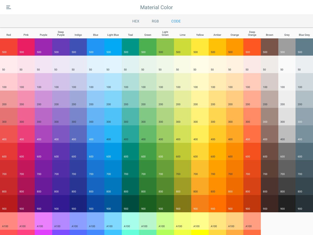
Material palette generatorImage result for material palette generator"

Material palette generator can be used to generate a

The Material palette generator can be used to generate a palette for any colour you input. An algorithmic adjustment of hue, chroma, and lightness creates…

READ MORE

The Material palette generator can be used to generate a palette for any colour you input. An algorithmic adjustment of hue, chroma, and lightness creates palettes that are both usable and aesthetically pleasing.

Input colours

Colour palettes can be generated based on the primary input colour, and whether the desired palette should be analogous, complementary, or triadic in relation to the primary colour.

Alternatively, the tool can generate expanded palettes, based on any primary and secondary colour.

Colour variations for accessibility

These palettes provide additional ways to use your primary and secondary colours, by providing lighter and darker options to separate surfaces and provide colours that meet accessibility standards.

The type system

The use of typography to present the design and content as clearly and efficiently as possible.

Type Scale

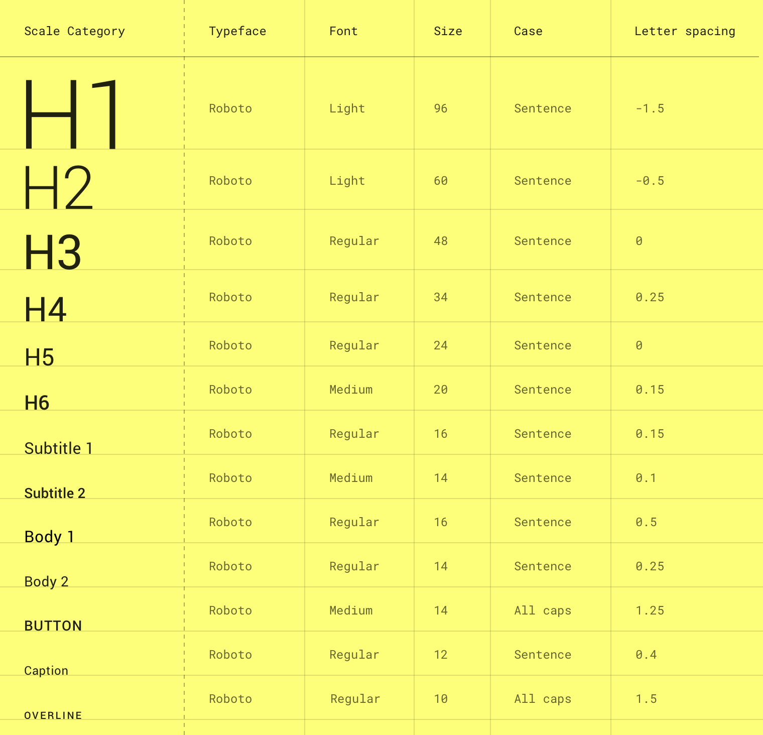
Material Design type scale includes a range of contrasting styles that support the use of customization when designing products.

The type scale is a combination of 13 styles that are supported by the type system. It contains reusable categories of text, each with an intended application and meaning.

Image result for type scale"

Font size units are used to express font sizes on android, IOS and the web.

Font Size Units

Platform              Android          IOS         Web


Font size               sp                    pt            rem


Conversion          1.0                   1.0           0.625

example of conversions

Android iOS Web
10sp 10pt 0.625rem
12sp 12pt 0.75rem
24sp 24pt 1.5rem
60sp 60pt 3.75rem

Shaping Material

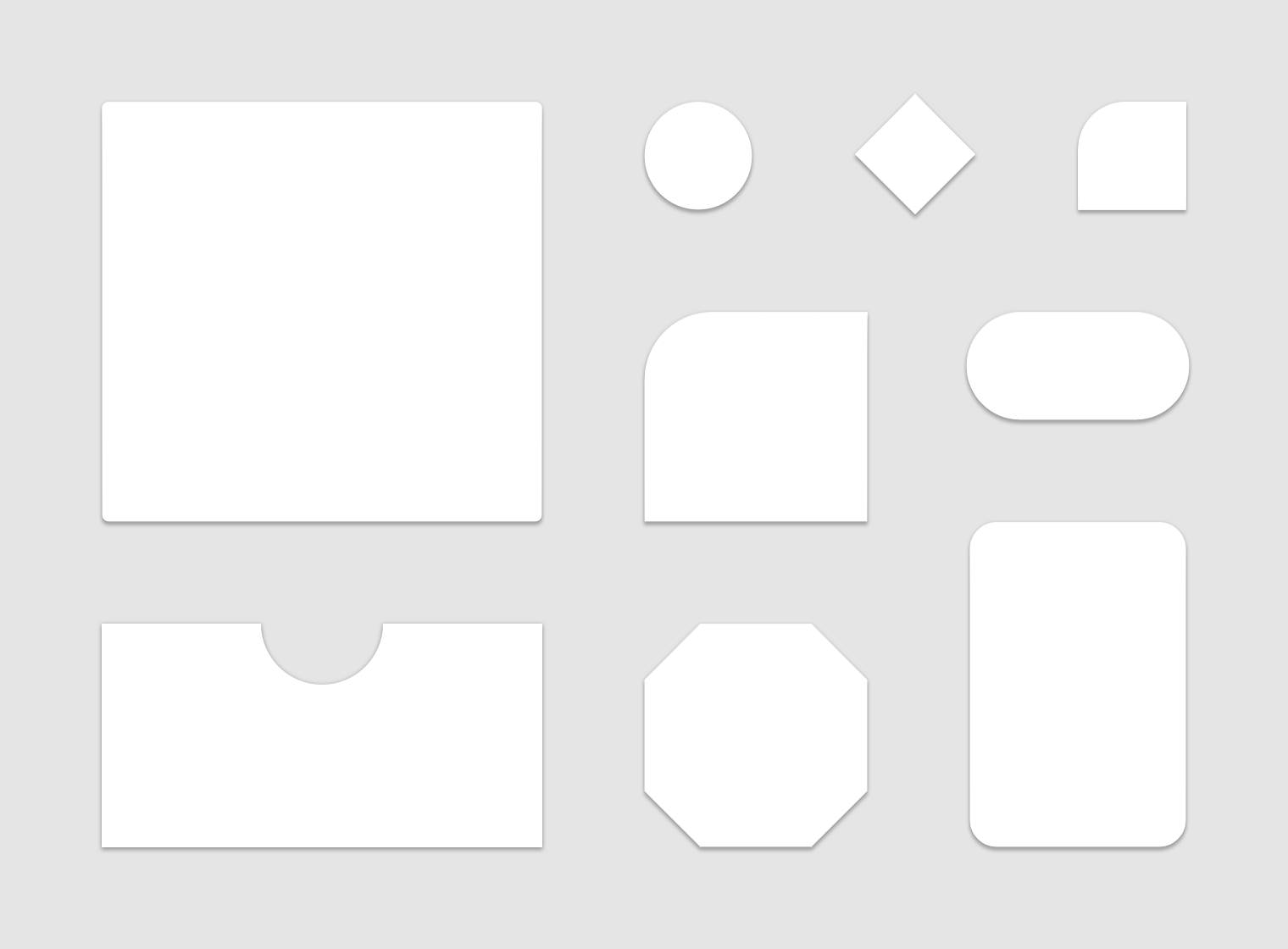
Material surfaces have a rectangular shape by default, with 4 edges. The corners can be shaped by customizing their adjustment:

  • Corner angles and curves
  • Edge angles and curves

the size of shape change can be subtle or more significant.

Usage

Because unique shapes stand out, they can direct attention to different parts of a screen. Shape provides a way for users to recognize components and…

Emphasis

Because unique shapes stand out, they can direct attention to different parts of a screen.

This combination of a round floating action button and curved bottom app bar stands out from the rectangular shapes elsewhere on the screen.

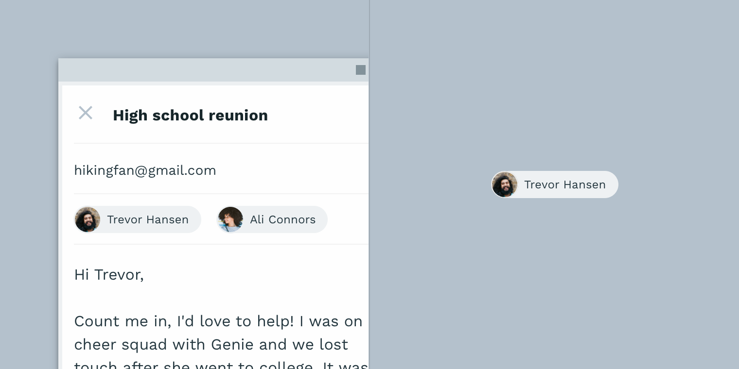
Identity

Shape provides a way for users to recognize components and identify different Material surfaces.

These entry chips can be identified by their consistent use of shape.

State

You can communicate the change of an element of the state by using a different shape from the rest of the elements or surfaces in that group. When using shapes to indicate a stage change, the consistency within that state, in every instance occurs

This card changes shape upon selection to indicate it’s been selected.

Branding

Branding is a visual language throughout an app, the use of shapes in tandems within other customization tools (like colour) in consistent ways. small adjustments to the shape, applied strategically through an app, contribute to the overall impression a brand makes.

The consistent use of shape throughout this app helps express its brand.


Microsoft design principles system

Microsoft is a leading tech company in production and software. Through recent years Microsoft has been working more on design choices through there industry. This change has been characterized by powerful foundations, new idea and choices, explorations. The philosophy of Microsoft design is exemplified by the clean, uncluttered app screens that are operated quickly, minimize typing, and automatically notification update design. The user would interact with the content rather than with controls.

Microsft Universal Windows Platform (UWP) is the key identity of the company, Windows being the main product of Bill Gates in the later 20th century. The basic design principles apply to the document system design and also the fluent design system and app building.

Effective pixels and scaling

same app on various devices

UWP apps run on all devices with Windows 10 from a TV, tablet or PC. it fits the screen size of any monitor/portable device. UWP helps by automatically adjusting UI elements so that they can easily interact with all screen sizes.

When an app runes on a device, the system uses an algorithm to normalize the UI elements display on the screen. The algorithm takes into account viewing distance and screen density (pixel per inch) to optimize the perceived size rather than physical size. The scaling algorithm ensures that the 24px font on the surface hub is just as clear as a 24px font on a phone screen.

viewing distances for different devices

From how the scaling system works, when they designed the UWP app they’re designing in-effective pixels and not physical pixels. Effective pixels (epx) are a virtual unit of measurement and they’re used to express layout dimensions and spacing, independent screen density.

Multiples of four


grid

The sizes of interface design should always be in the multiples of 4 (epx)in UWP apps. UWP scales across a range of devices scaling plateaus of 100%, 125% 150% till 400%. The reason that the base unit is 4 instead of any other number is that 4 is the only integer that can be scaled by non-whole numbers (example, 4*1.5=6) using multiples of four aligns the UI elements whole pixels to ensure UI elements have a professional-looking interface.

Layout


Frame

Since UWP apps automatically scale to all devices desgin a UWP app for any device follows the same structure.

Windows, Frames, and Pages

When a UWP app is launched on any windows 10 device, it launches in a window with a frame, that can navigate between pages instantly.

UI has a collection of pages as if it was a chrome pop-up, allow for multiple ways to navigate work and personal use.


Frame

Page layout

This example of page layout follows a common structure to provide consistency, so user can easily navigate between and within pages of your app. Pages typically contain three types of UI elements:

  • Navigation elements to help users choose the content they want to display.
  • Command elements to initiate actions, such as manipulating, saving, or sharing content.
  • Content elements to display the apps content.

A common layout pattern

  • Navigation elements to help users choose the content they want to display.
  • Command elements to initiate actions, such as manipulating, saving, or sharing content.
  • Content elements to display the apps content.

Controls

UWP controls

UWP’s design platform provides a set of common controls that are proficient and work on Windows-powered devices. They adhere to the Fluent Design System principles. like buttons and text elements, to sophisticate controls that can generate list from a set of data and a template.

StyleAccent color gif

Common controls automatically reflect the systems theme and accent colour, work with all input types, and scale to all devices. Common controls use light, motion, and depth in their default style, so by using them, your incorporating the fluent design system in the app.

Common controls are highly customization, allowing for foreground colour control and to override the fault styles in control.

Shelltiles on start menu

The UWP app will interact with a broader windows experience with tiles and notification in Window shell. Tiles are displayed in the start menu and when your app launches, and they provide a glimpse of what going on in your app. UWP apps have four tile sizes (small, medium,

Inputsinputs

IWP apps rely on smart interactions. and have customize-able interaction without having to know or define whether the click comes from a mouse, a stylus, or a tap of a finger.

Devices

devices

While UWP automatically scales your app to different device, it can be optumized with specific devices.


Susan Klare

TOP 9 QUOTES BY CLEMENT MOK | A-Z Quotes

Susan Kare is an artist and graphic designer best known for her work in interface elements and typeface contributions to the first macintosh in the 90s. She was also a creative director at NeXT, the company that was formed by Steve Jobs after he left Apple in 1985 and has since contributed to Microsoft, IBM, Facebook, and Pinterest.

Kare’s first job was at Apple CompuWhat Would Jane Austen Do?: July 2007ter after receiving a call from her former high school Andy Herzfeld (a computer scientist who was a member of the Apple macintosh design team), in the early 80s. She worked at Apple starting in 1982  and was originally hired into Macintosh software group to design user interface graphics and fonts. She later became the Creative Director at Apple. Creative Swecixwa working for the Director of that organization.

Old Mac | Graffletopia

After her work in Apple Kare went on to accept a job into the designer team of NeXT as the 10th employee and worked for clients such as Microsoft and IBM.

After completing her tenure at Apple Computers, Kare accepted the job offer as a designer for NeXT. There she served the clients such as Microsoft and IBM. Working with Microsoft she managed the card deck for Windows 3.0’s solitaire game project. She also designed multiple icons for the Windows 3.0. She created icons and design elements on Windows 3.0.

iconographies to make the Macintosh feel less like a machine and more like an easy-to-use, relatable workstation. As the first low-cost personal computer for nontechnical consumers, it was imperative that the Macintosh icons be universally inviting and intuitive.

According to Kare, good icons should be more efficient like road signs rather than mere illustrations. they should be easily comprehended and keep the user from getting confused by extraneous details.


Rotoscoping

Rotoscoping is an animation technique which takes the live-action video of people and lining out each individual frame in a realistic constant pattern. animating over each individual movie frame allows the animator to get the realistic movement of a human.

Rotoscoping has often been used as a tool for visual effects in live-action movies. By tracing an object, the moviemaker creates a silhouette (called a matte) that can be used to extract that object from a scene for use on a different background. While blue- and green-screen techniques have made the process of layering subjects in scenes easier, rotoscoping still plays a large role in the production of visual effects imagery. Rotoscoping in the digital domain is often aided by motion-tracking and onion-skinning software. Rotoscoping is often used in the preparation of garbage mattes for other matte-pulling processes.

Rotoscoping has also been used to create a special visual effect (such as a glow, for example) that is guided by the matte or rotoscoped line. A classic use of traditional rotoscoping was in the original three Star Wars movies, where the production used it to create the glowing lightsaber effect with a matte based on sticks held by the actors. To achieve this, effects technicians traced a line over each frame with the prop, then enlarged each line and added the glow.

Rotoscoping was invented by the Animator:

Max Fleischer

Gary Lucas :: Gary Lucas' Fleischerei

Born on the 19th July 1883

died 25th September 1972

Around 1914 Max Fleischer invented the first commercially produced animating cartoons which started to appear in movie theatres. Around the time of the birth of animation, it was often stiff and jerky the difficulty it would take to get every frame on paper unbelievable time-consuming.

Max Fleischer devised an improvement in animation through combined projector and easel for tracing images from live-action films, this device, known as the Rotoscope enabled Fleischer to produce the first realistic animation since initial works from Winsor McCay although his patent was granted in 1917 with his brothers Joe and Dave Fleischer they made the first series of tests between 1914 and 1916.

Facts

Max Fleischer is the creator of Betty Boop, Koko the Clown, and Dimbo the Dog.

Max Fleischer and Dave Fleischer were leading animators of Walt Disney’s Company “Disney”.

He is also the Man who Created Popeye the sailor man.